Upgrading from Apple Watch Series 3 to Series 8
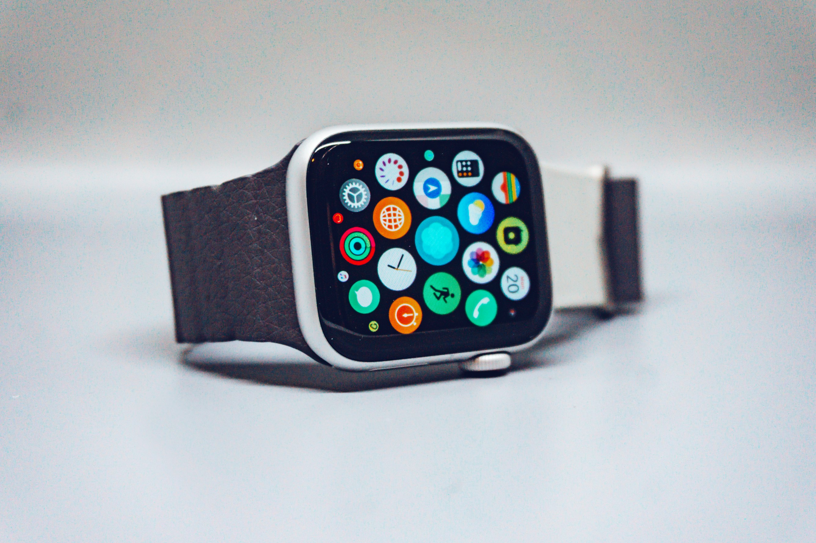
I recently upgraded my Watch Series 3 42mm Cellular to the Series 8 45mm Cellular, and I can sum up my reaction to the change in one word: Wow
However if I were to use more words, I would mention these 3 things as the biggest improvements I immediately noticed after strapping on the new 45mm time keeper.
NOTE: I shared this post on Reddit. Join in on the discussion.
The Screen
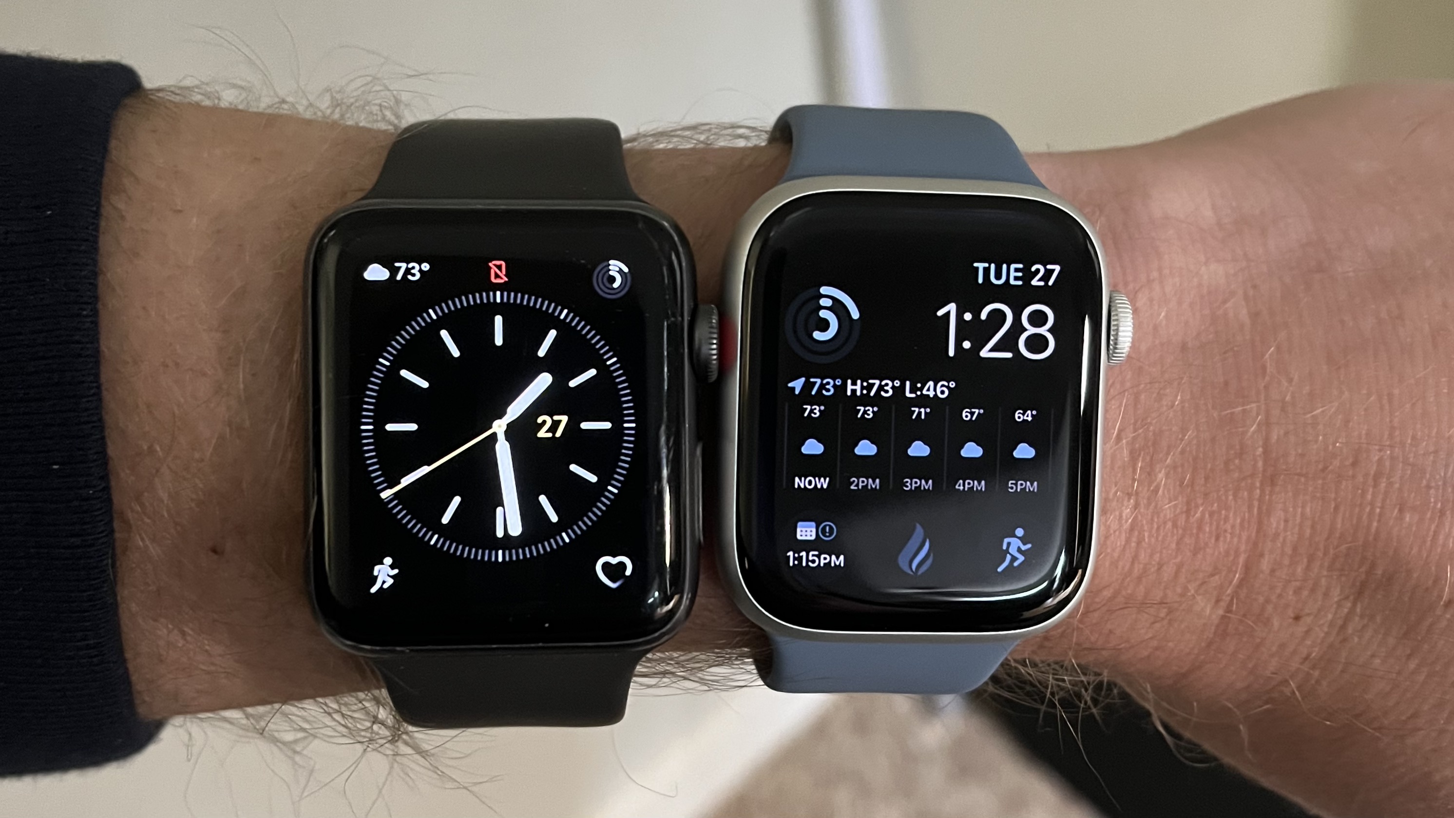 Holy smokes the screen. Coming from the 42mm S3, the size of the new edge to edge display in this 45mm S8 makes more difference in regular usage than I anticipated. It feels so much roomier and less prone to accidental taps on the wrong thing.
Additionally, the always-on-display is the game changer I didn’t know I needed. It completely removes the forceful (and dorky) wrist flip that was necessary to trigger the screen to come on to catch the time or see that notification that just came in.
I love this face that beautifully compliments my slate blue sport strap.
The Digital Crown
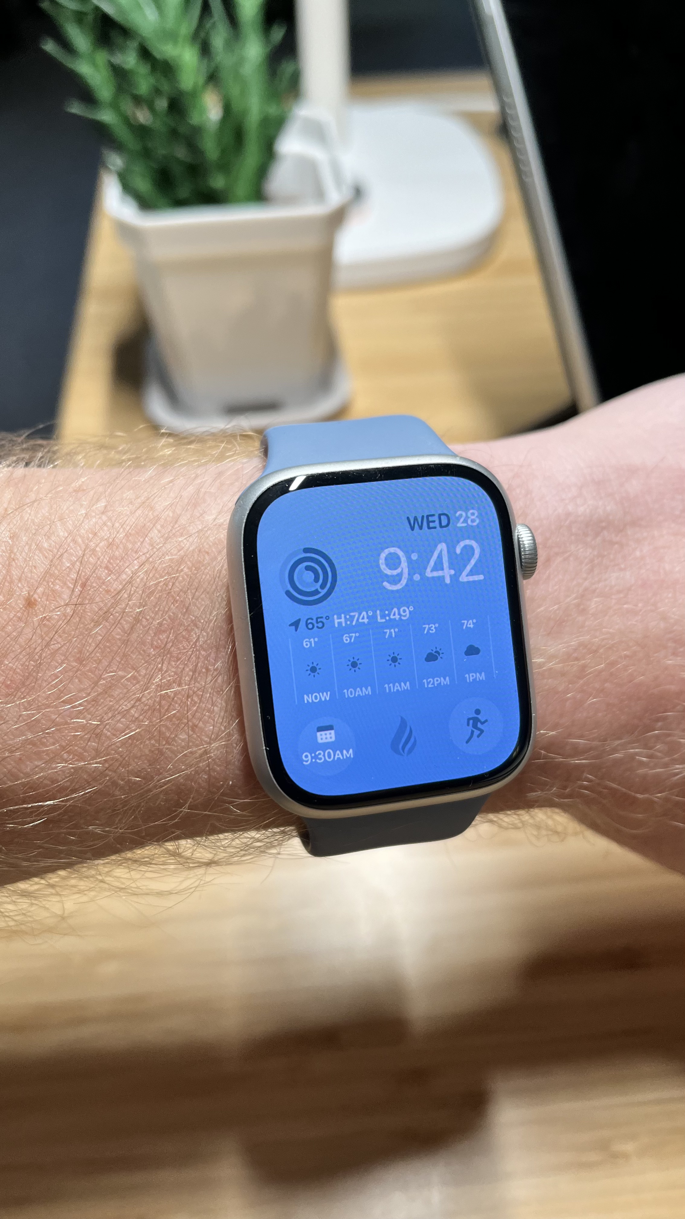
This one I didn’t anticipate being all that different. However the use of the Ditigal Crown is greatly improved in the Series 8 over the Series 3. The Series 3 Digital Crown featured smooth scrolling, and it felt as if it had some weight to it - as if it actually took a bit of effort to turn the dial.
With the Series 8, the Digital Crown is much easier to turn, making it feel lighter and more welcoming. Additionally, it brings haptic tics with the scrolling so you feel a more tactile interaction while scrolling about. It’s quite a nice experience.
A joy to use
Quite honestly, the Series 3 had been a drag to use for anything other than really just telling the time. It was sooo slooooow. Not only was it slow, but 3rd party apps were dead to me. They took maybe 10 minutes to install, and then using them would usually crash the watch, so I just stayed away from them.
However with the Series 8, navigating around apps, settings, and menus is super fast and pleasant! Yesterday I went for a walk leaving my iPhone behind. I popped in my AirPod Pros, started an Outdoor Walk workout, and loaded up a recent podcast all in just seconds… it was a great experience.
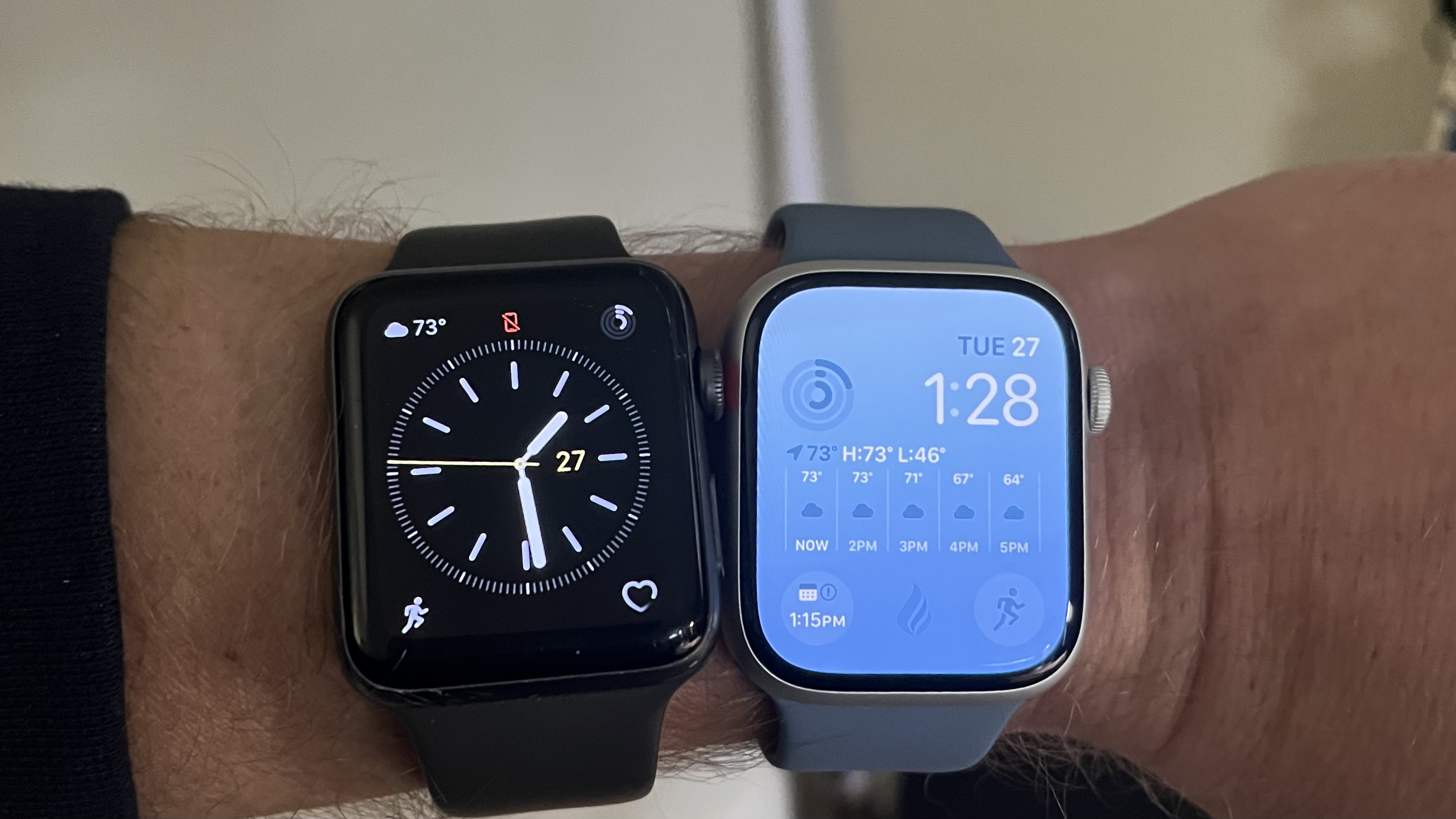
Notables
A few other things I’ve found myself enjoying about the new Series 8 Apple Watch:
The rounded design. I was really quite disapointed when the Series 7 was announced that it didn’t feature the flatter design that would have brought it closer to the design of the current iPhone and iPad models. This redesign was rumored for months leading up to the event, and I fell in love with the mock ups that were circulating. However comparing the new rounded design against the Series 3, I like it much more than I thought I would. It reminds me of an old rounded television design, which is actually quite classy!
Notifications. In the Series 3, every notification that comes is full-screen, blocking whatever it was you might have been looking at or interacting with. The Series 8, however, acts more like an iPhone with smaller notifications being announced at the top of the screen. A very welcomed change!
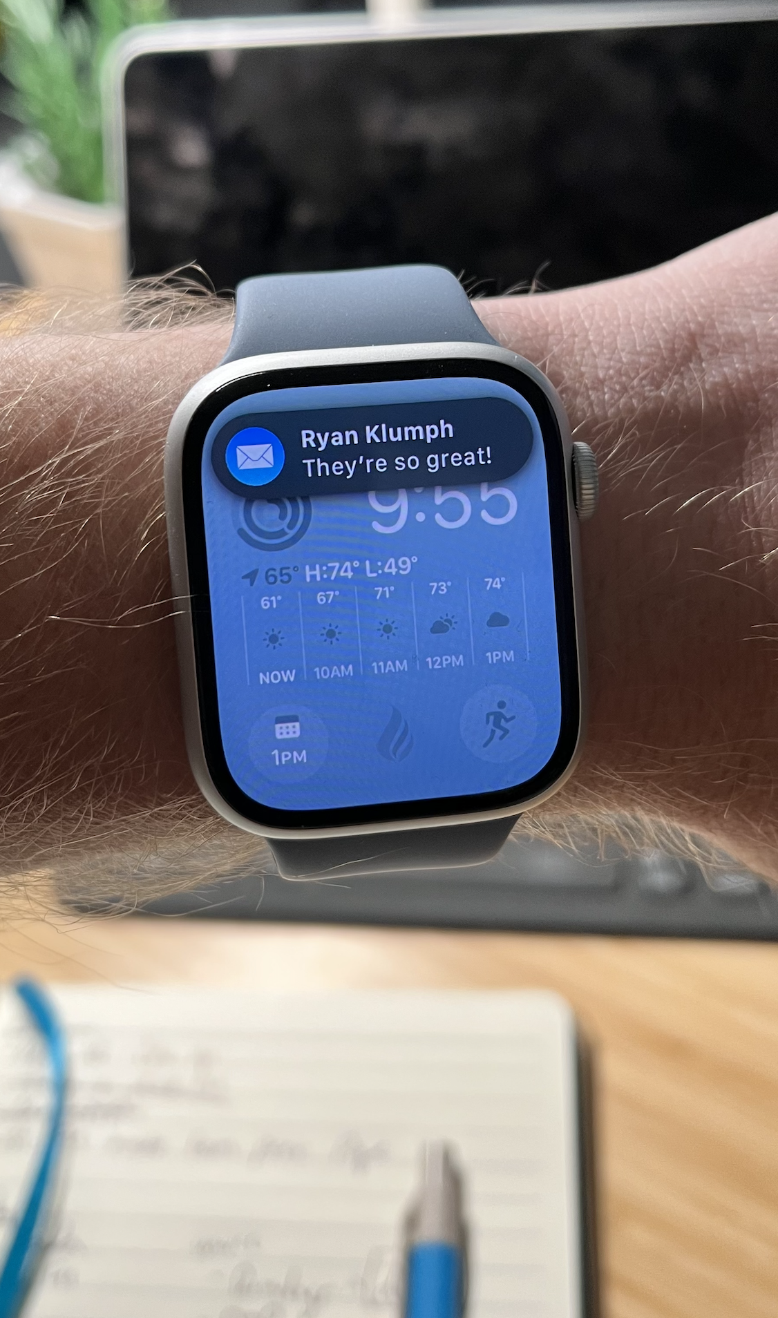
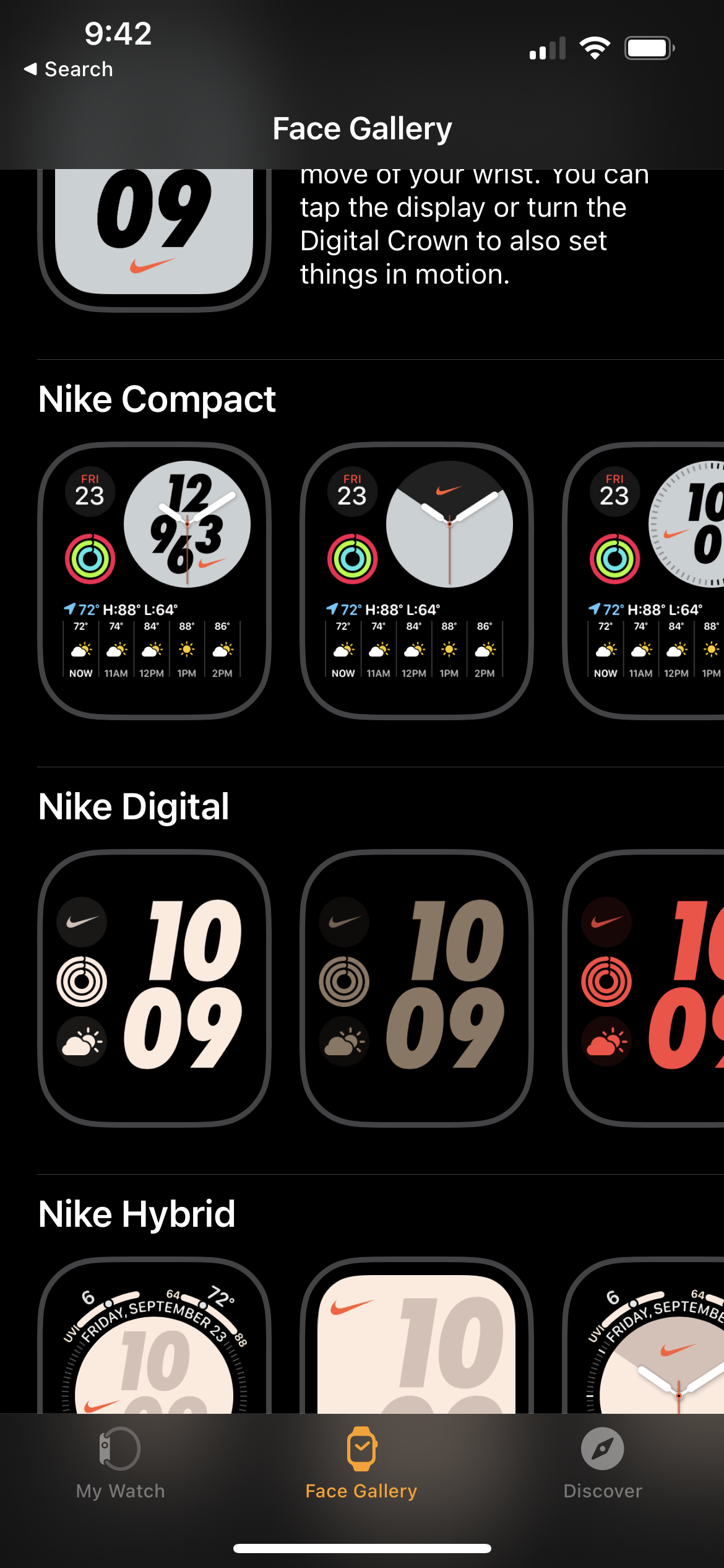
Waaay more watch faces. I knew that my Series 3 didn’t have as many watch faces as newer models, but I didn’t really care as the faces it did have met my needs. Or so I thought.
I was pleasently surprised to find that the Series 8 had sooo many more watch faces in the gallery. Like… a lot more. And not only more, but each face is much more customizable and configurable due to the increased real estate. Series 8 includes not only the new faces that debuted with each generation between it and the Series 3, but also all of the Nike faces previously reserved for the Nike Edition.
Conclusion
If you happen to have a Series 3 (or heaven forbid, something older!) and are wondering if now is the time to consider an upgrade, I can say without hesitation that you will enjoy your Apple Watch Series 8 significantly more than your Series 3.
Thanks for reading!

