So you want AI to create your app icon
2023 is nearly gone and you’d be hard pressed to find marketing material, stock photos, and logos that weren’t created using some amount of artificial intelligence. Generative AI has exploded in popularity and it’s never been easier to dream up a design, and walk away with high quality results in minutes.
In my cirlces on the interwebs, this can be especially freeing for Indie Devs who have little to no budget or skill for graphic design. I’m not going to argue one way or the other about hiring professional graphic designers vs using Generative AI, though I think that’s a worthy discussion for another day. In this post, I’m going to share how Gen AI has helped me with icons and design in some of my projects.
Embracing AI’s potential
I learned that sometimes a vague prompt would render a higher quality result than a really detailed prompt.
My first venture into generative AI was in June 2023, using DALL•E to come up with an alternate icon for my app, Hello There. The app’s original and primary icon was designed by a professional, and it’s absolutely a great looking piece. To provide paying users with more customization, I decided to include not only color variants, but also some extreme variants that completely changed the feel of the app on their home screen. This is where Gen AI came in handy.
Using DALL•E, I started playing with prompts to see what kinds of pelican designs it could produce. Every prompt would result in images that would spark additional thoughts or inspirations to adjust and tweak for the next attempt. I played with many different keywords and styles, not really knowing what the results would be. I learned that sometimes a vague prompt would render a higher quality result than a really detailed prompt. Several of the designs are available today in Hello There, but there is one that certainly stands out above the rest. It took nearly 30 tries of refining the prompt to get to something that I thought was truly special:
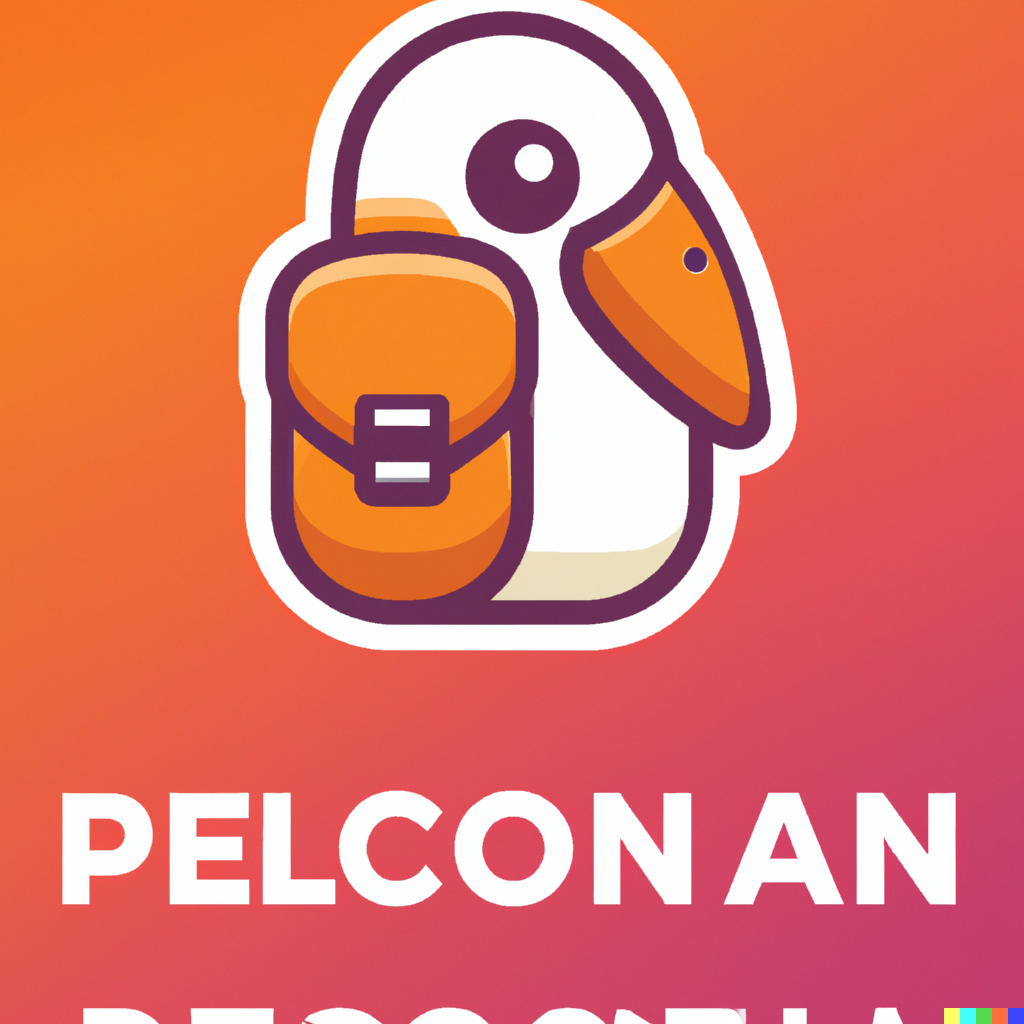
“Ultra adorable pelican with messenger bag app icon”
Ok so a few observations:
• The generated image is obviously not usable as-is for an app icon, but I could instantly see its potential
• The prompt was extremely simple & vague. Intentionally leaving out details means the other 3 images that were generated along with this one were nothing alike
• The key words that seemed most impactful to this prompt vs my previous attempts were ultra, adorable and app icon
I knew I wanted to use this design, but wasn’t sure where to turn to get it to a usable state. Obviously it needed the gibberish removed, the pelican itself centered and likely redrawn as the slightest amount of its head is cut off, and the colors were ok, but needed some work. I can do basic image editing and manipulation in Gimp, but what this image needed was outide of my expertise. Fortunately, I got to work with Basic Apple Guy to turn this into a usable icon design that is available today in Hello There:
![]()
Source: Basic Apple Guy
Exploring available toolsets
When I released Bento|Craft in October 2023, the app was much more of a side project than my other apps. From early on, it was intended to be a free tool for developers and designers alike. So when it came time to come up with an icon, I knew it had to be something fun and eye-catching, but also something that didn’t require much, if any, financial investment.
I decided to give Bing Image Creator a try. Although based on DALL•E, my experience with it seemed to render slightly more useful results. It took about 20 prompts to land on something I was happy with:
![]()
Minimalist flat Bento Box containing colors, personified with cute eyes using vibrant colors, gradient background, purples and blues
Some observations:
• The keywords that appeared most impactful were cute eyes, vibrant colors, gradient background, and specifying purples and blues
• Many of the previous iterations included weird artifacts and overly complicated compartments that wouldn’t scale well for an icon
• This resulting image was almost completely usable as-is requiring only minimal post-processing for upsacling, sizing, etc
The final icon got a few shout outs in the community and was generally well received.
The path to Midjourney
Two months later, I decided to include alt icons for Bento. I’ve heard many great thinks about Midjourney, but was always a little turned off by its Discord-only access and paywall. How much better could it really be? It turns out, quite a lot.
To create the alt icons in Midjourney, I wanted designs that were somewhat familiar, as if they were inspired by the same original icon. Dare I say, a fleet of icons similar to the fantastic alt icons Apollo once had. Luckily, Midjourney makes it quite simple to upload a source image and then prompt it for images inspired by the source. You can specify how close to the original it should be, or if it should have more liberties with its design.
I probably worked over 100 prompts in finalizing the 4 icons I included in Bento|Craft's Variant One Icon Pack. Once I found a vein of prompts I liked the direction of, I would continue testing variations and slight prompt tweaks. Here’s one prompt that I started with, while providing the source Bento Craft icon as a reference:
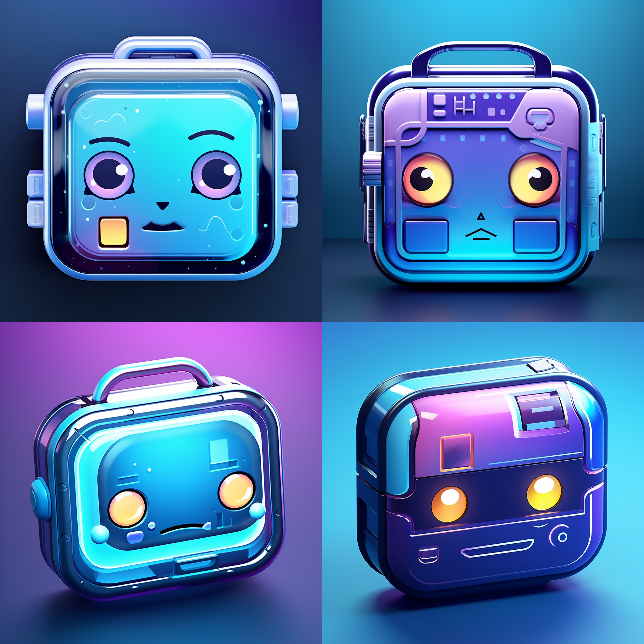
A Tron style icon in the theme of a cute personified bento box with multiple empty compartments, mostly square shaped, has only one face --no food
The direction was good, but none of the options were quite right. The smaller details would get lost in the actual icon, and the faces needed to ‘front and center.’ About 15 variations and prompt tweaks later, I landed on this:
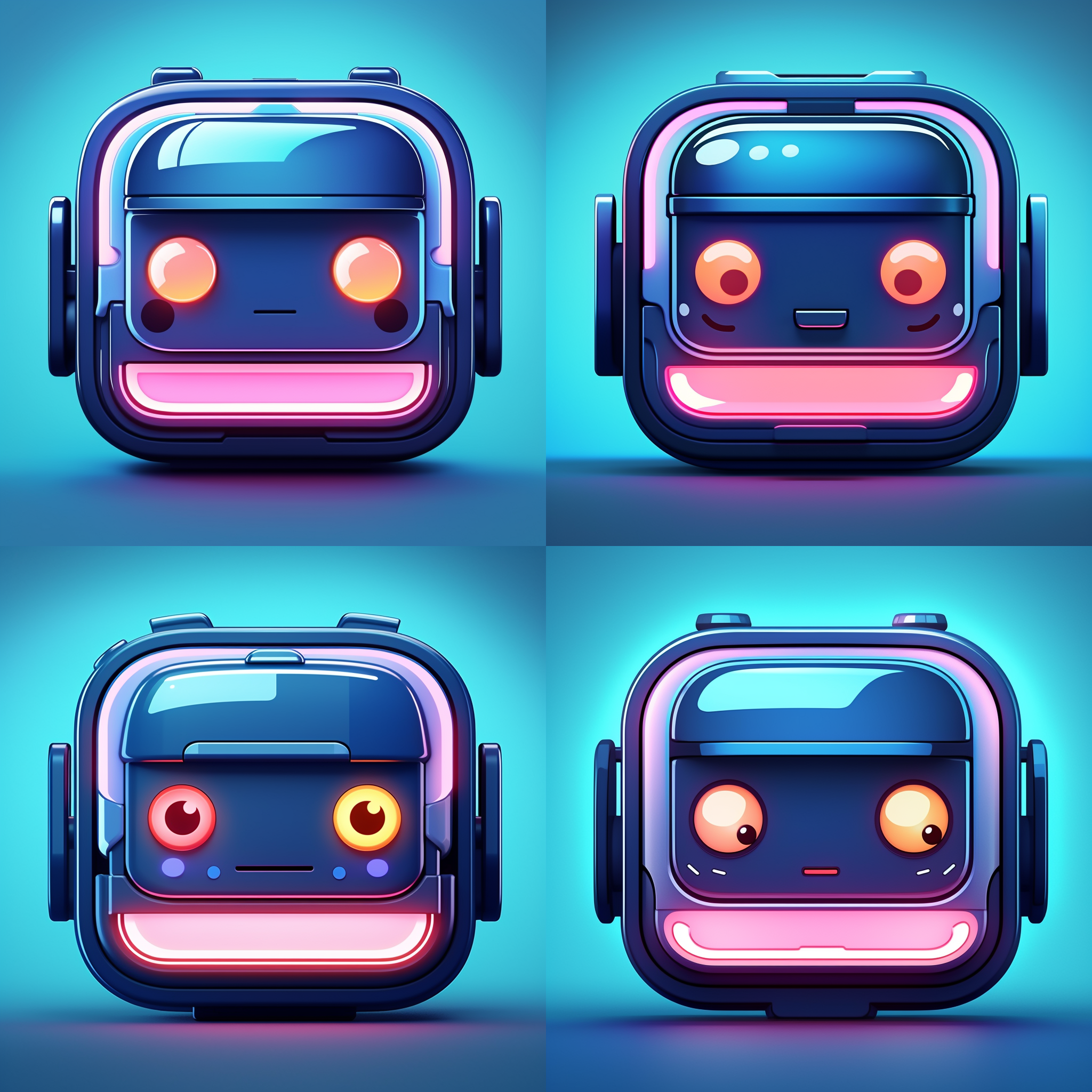
A Tron style icon in the theme of a cute personified bento box --no food
Notice that yet again, less specifics and more flexibility allowed for a better result. Perhaps one of the best things about using Midjourney for app icons is how icon-ready the results can be. All of the above examples can be thrown into Jordi’s Bakery app with little to no processing or editing needed. You can find all 4 of the final Variant One icons in the latest version of Bento|Craft availalable now on the App Store
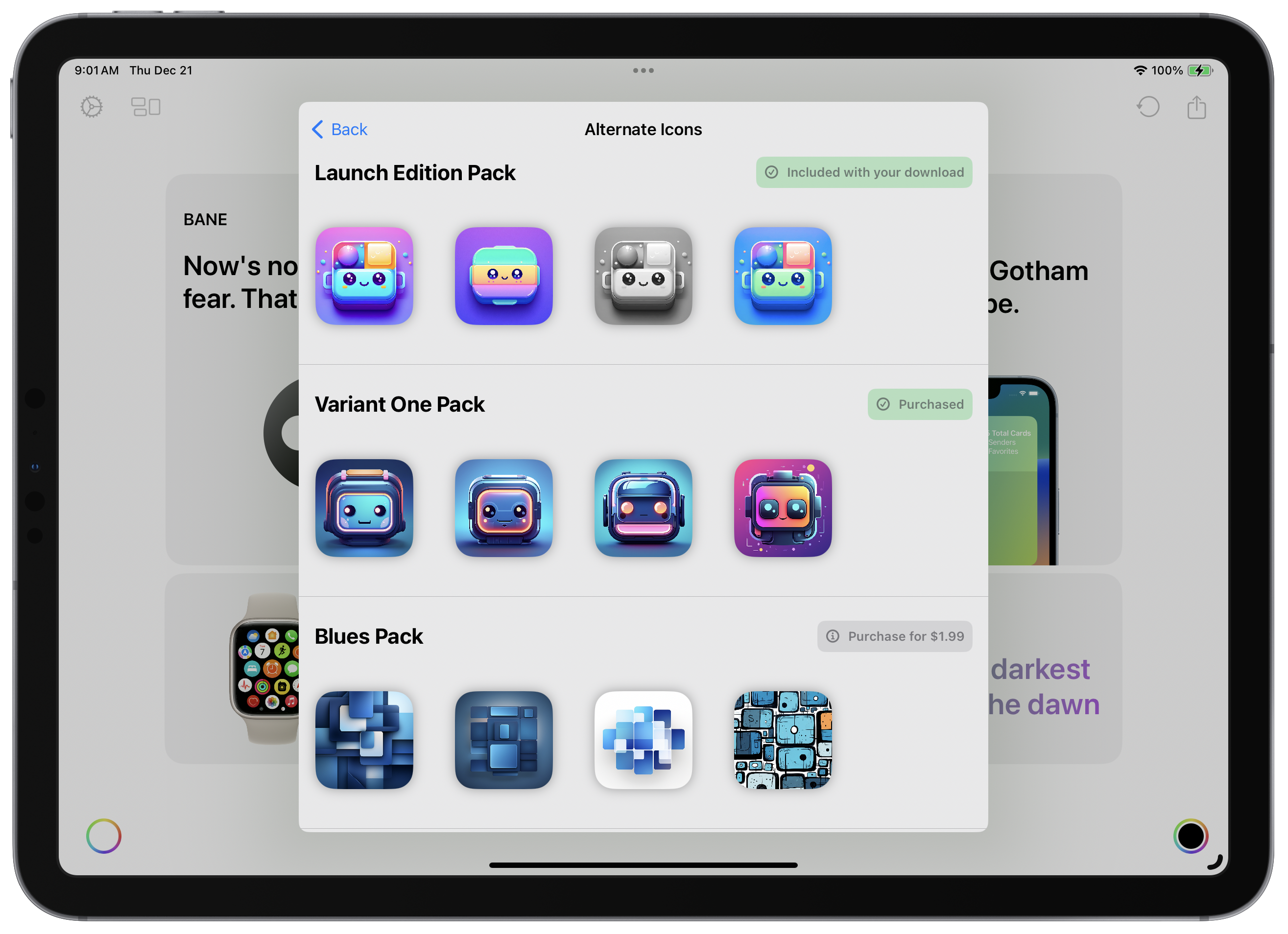
A few Bento|Craft rejects
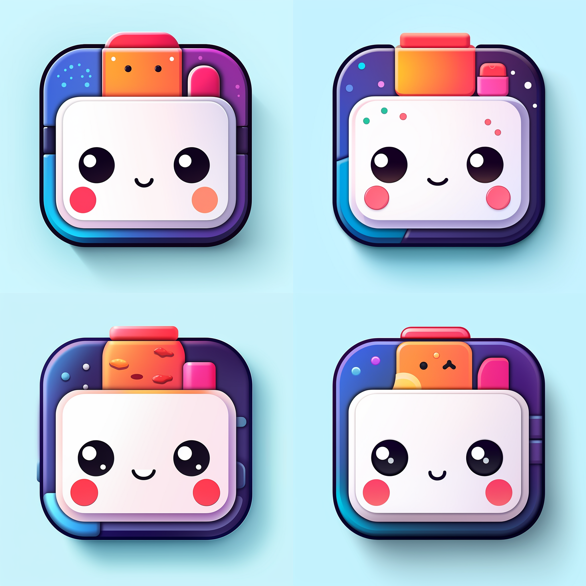
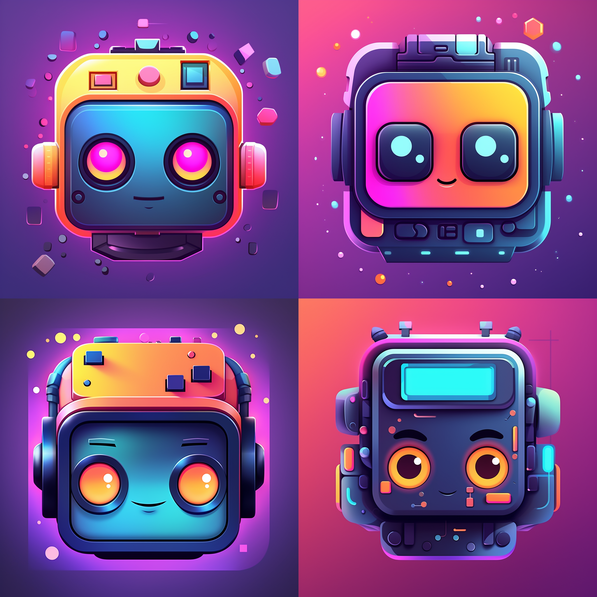
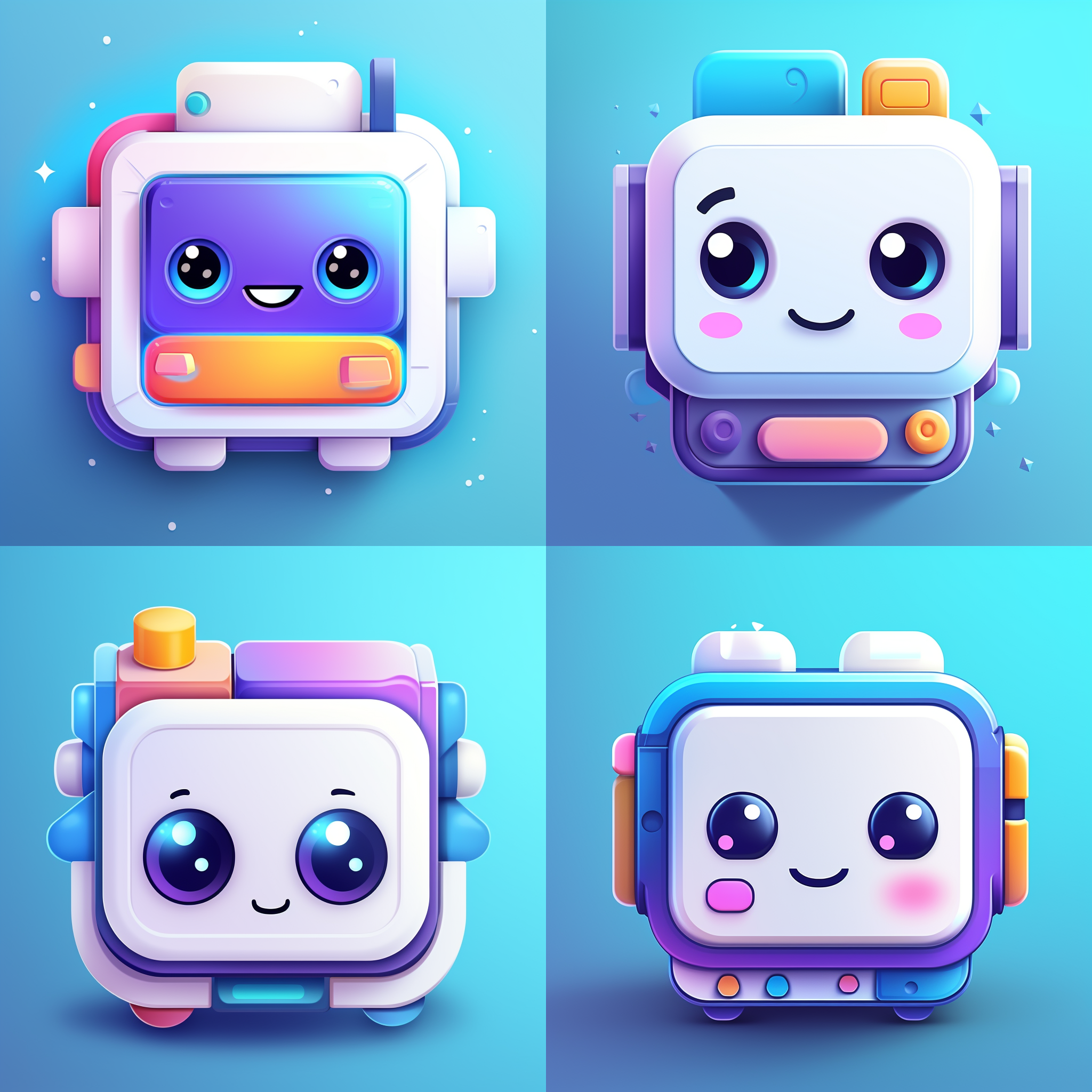
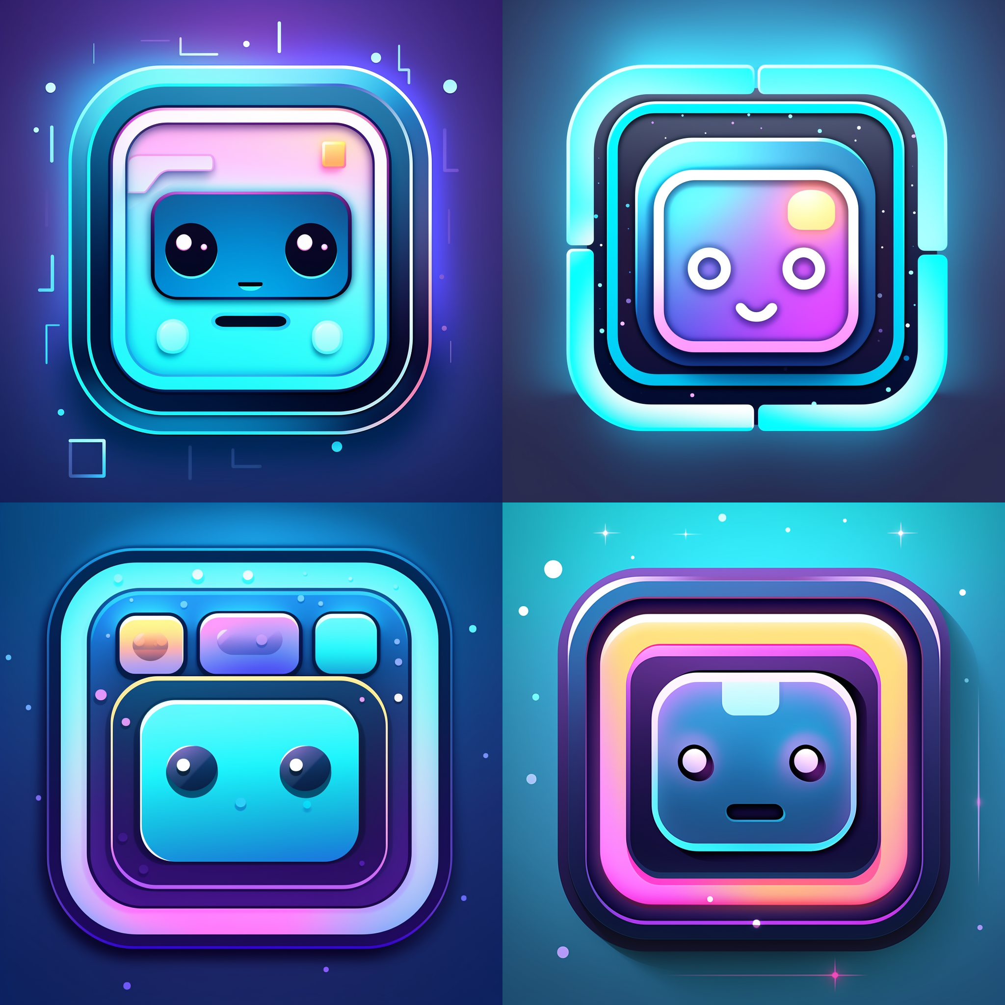
Here are a few more Midjourney results for Bento that didn’t make the cut if you’re interested:
To see more examples of what Midjourney can do, especially what V6 is capable of (like extreme photorealism), check out Steve Troughton-Smith’s thread on Mastodon.