Developing apps is like homeownership: you’re constantly fixing things, upgrading things that still work but ‘it’s time’, and you’re probably still in debt over it. But somehow it doesn’t take away the joy and the pride of it all. I’ve been working hard on the latest update to Hello There and it ended up becoming probably the biggest update since its launch.
Simplification
The scope of an app is something I’ve always felt evolves somewhat over time. You want to focus on achieving a task really well, but you want options, flare, other things that would make a user say, “hey that’s nice.” But these things can sometimes take away from the primary function and end up being a distraction.
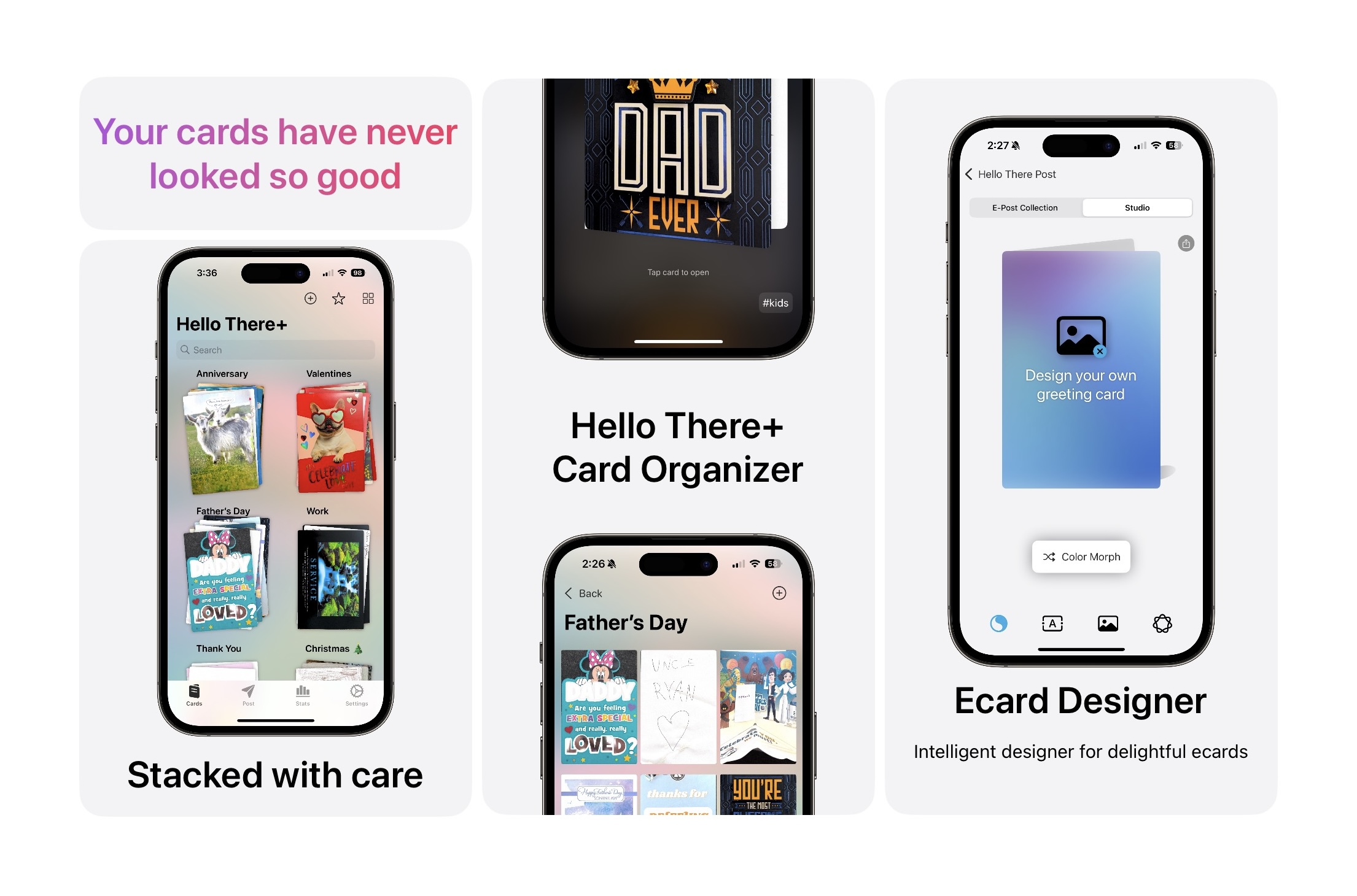
I decided to simplify my greeting card organizer app, Hello There, in several ways. And when the idea hit me, I wish I had thought of it much, much sooner. I’m getting rid of the abstract concept of collections which allowed users to select a color theme, and add a cover image from their photo library or from the vast library of copyright-free images from Pexels, and then cards added would belong to these collections. The idea of cards belonging to a category needed to remain - think of it like a Hallmark store: Birthday, Valentine’s, Sympathy, Thank You, etc.
These categories are now called stacks. And they’re defined by you. But why stacks? Because generally that’s how we store greeting cards in real life. I literally have a stack of Christmas cards from last year sitting on a coffee table that need dealing with. And thus, you can understand the new visual design of these simple stacks, featured right on the main page when opening the app.
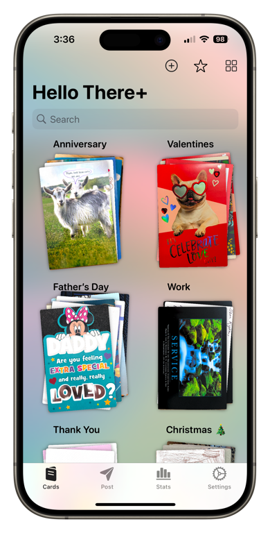
One fun bit about these stacks – they shuffle a tad every time the view reloads, so they never look exactly the same.
Additionally, part of the simplificaton process, Nudges were removed. I realized that even though the idea of creating custom alerts aligned with special occasions fit the overall theme of the app… most people like to keep reminders and alerts neatly organized in a single location – be it Apple Reminders, Google Tasks, etc. So Nudges are gone for now, along with the widgets that accompanied them.
Interaction
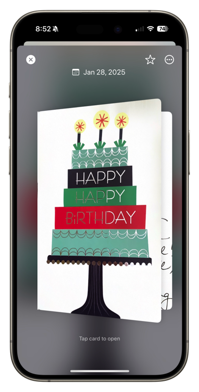
In light of simple ideas… a greeting card should look like a greeting card. I was always a little disappointed with my own implementation of viewing cards in Hello There as it was simply flat, uninspired images of cards. Nothing inherently wrong with that, but c’mon. A card should look like card. So I’m happy to introduce 3D card interaction.
This is enabled by default, and can be turned off per card. Most standard cards will work really well with this format, but some won’t. Pop-up cards for example. Or cards with multiple pages or odd shapes. For these situations, you can still photograph the cards however you want, and then disable the 3D interaction and it will show your tab view of images just like before.
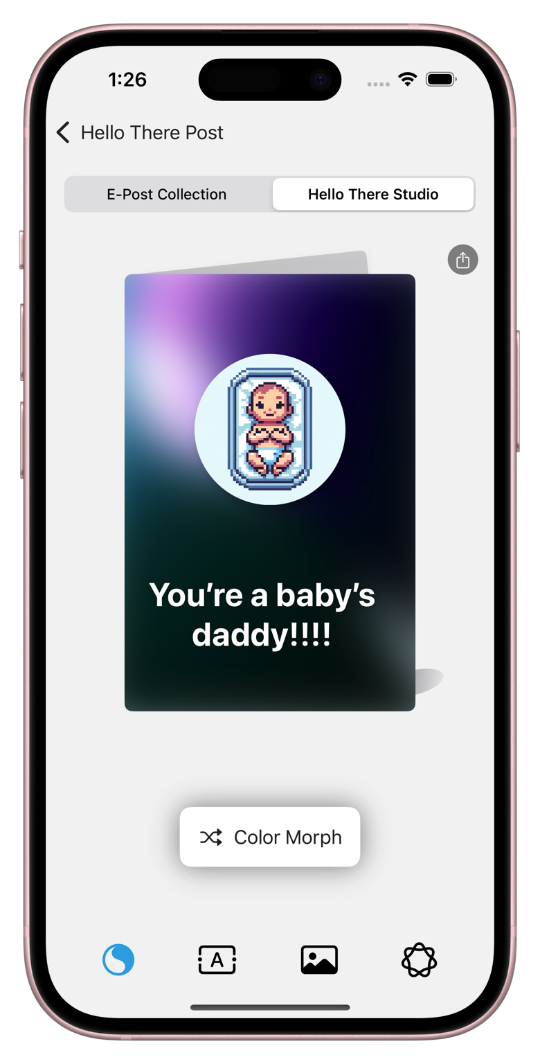
Intelligent E-Post
E-cards are called E-Post in Hello There. The term post is used because Hello There Post consists of two ways to send post, or cards, to other people: ecards, and hand-written letters via USPS. I really enjoyed making the E-Post collections and I’ll likely make more in the future. But with generative AI, it makes much more sense for allowing users to create their own cards with their own wording and their own images. Introducing E-Post Studio, an intelligent and delightful ecard designer.
Studio is powered by OpenAI for now. I’d like to eventually move this to Apple Intelligence for a native and locally processed experience, but that will have to come at a later time when Apple Intelligence is more mature and accessible. For now, users will be happy with the performance and results of Dall-E 3 as the backend.
App Store
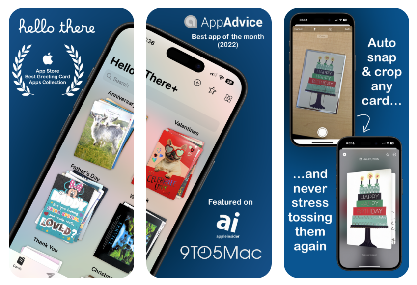
Like when it’s time for a new bedspread or new towels… it was time for a new App Store presence. App Store screenshots pair with ASO in a way that really impact first impressions. Lame screenshots don’t encourage installations. So with the help of Picasso I went back to the drawing board and came up with a new theme that I’m very happy with. Somewhat inspired by the Calm app listing, the first 3 images include accolades, compelling image, and the basic point of the app.
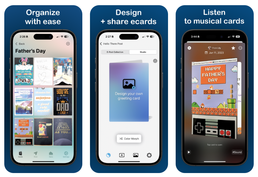
The rest of the images are for those with piqued interest, and each screenshots focuses on an action. Notice each word at the top is a verb. You can see the rest of the screenshots not included here on the app store listing.
Ending for now
Like a house, there’s always more to do. However I hope users will appreciate the new direction, look, and features of Hello There. If this post is up, it means these updates are already available, or will be very soon. Watch for version 2025.2 and let me know what you think.