What makes SwiftUI so fun is how easy it is to whip together designs that are modern and refreshing. SwiftUI’s declarative nature invites developers and designers alike to tweak, adjust, and fine-tune designs with minimal effort.
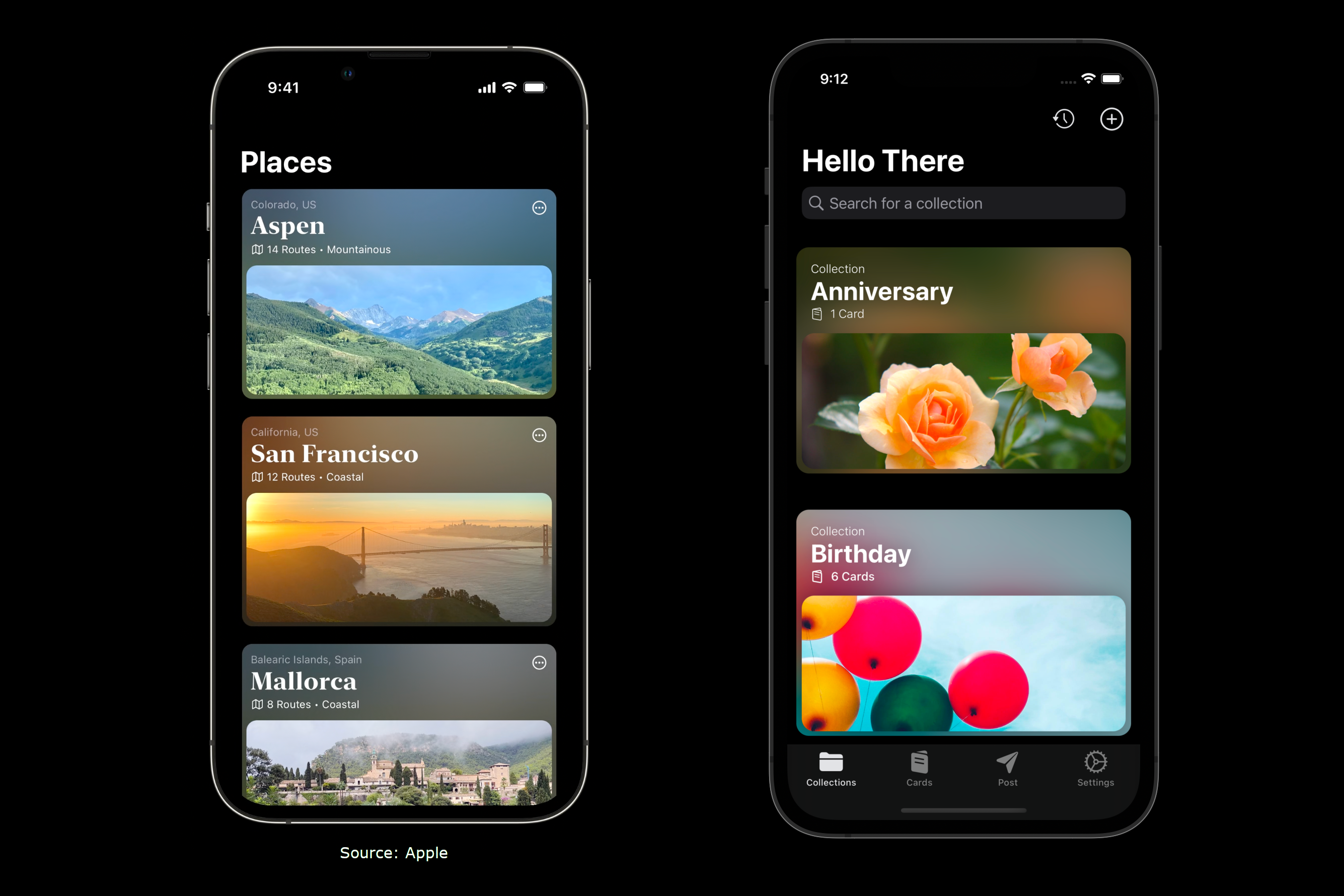
Recently I came across a neat design in a mock app Apple demoed during a WWDC22 session and decided to adapt it to my iOS 16 app, Hello There.
Testing some designs inspired by WWDC videos 👀#SwiftUI pic.twitter.com/kpuh8ZUYUy
— Ryan (@thatvirtualboy) January 26, 2023
The Apple design (pictured right in the tweet above) takes a single photo and creates two layers:
- The background layer is highly blurred and slightly magnified
- The foreground layer is cropped and filled to the wide rectangle frame
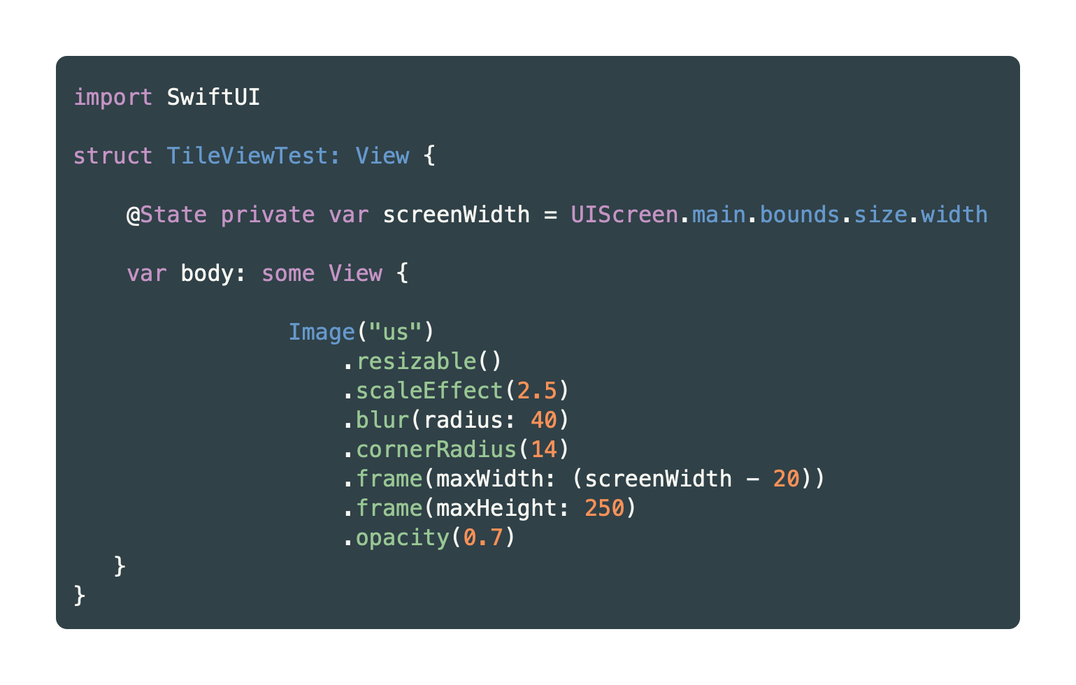
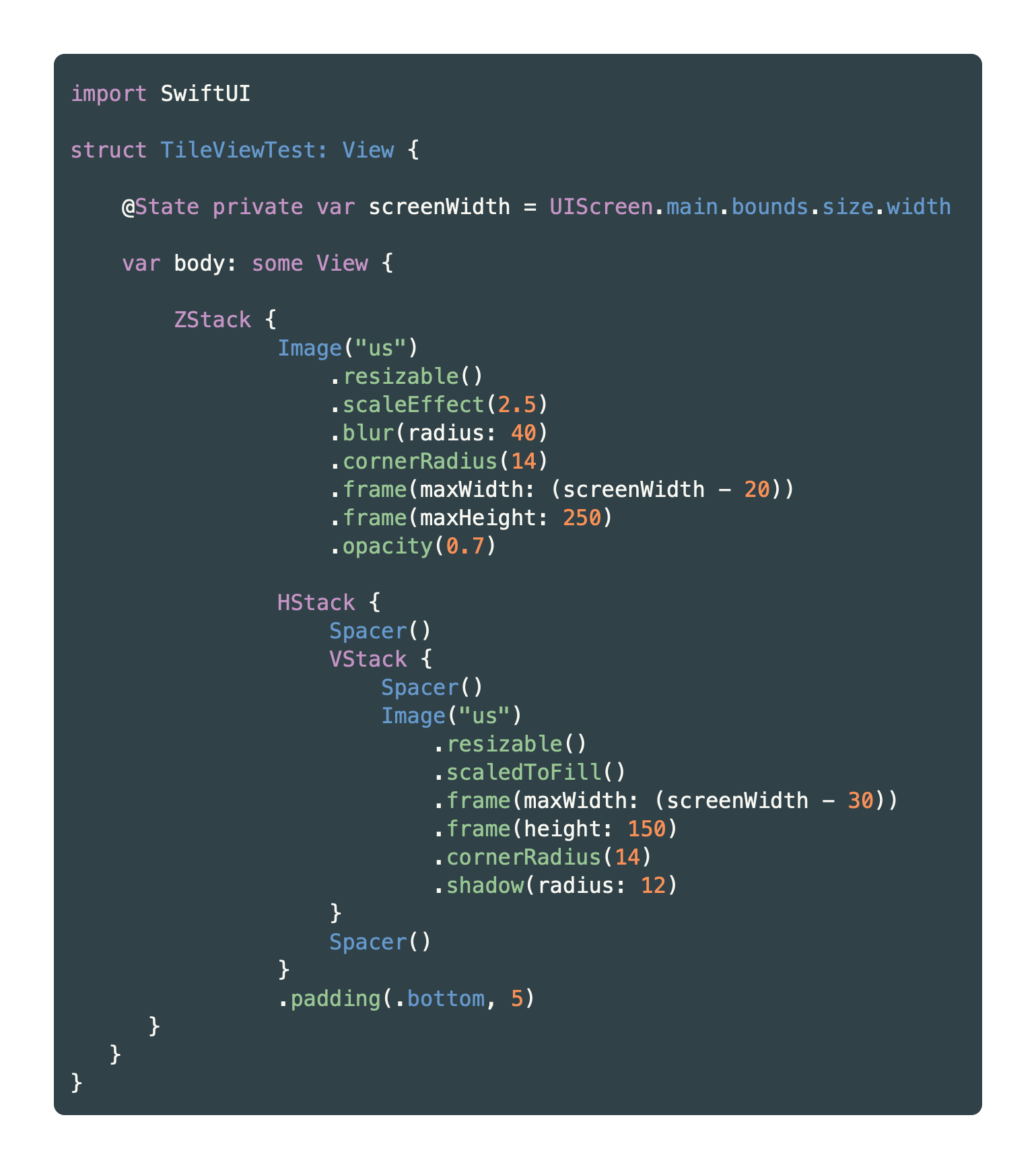
Let’s take a look at how to accomplish this. Let’s start by picking an image, adding it to our project’s Assets.xcassets folder, then creating the background layer. In this example, I’m using an image named “us”.
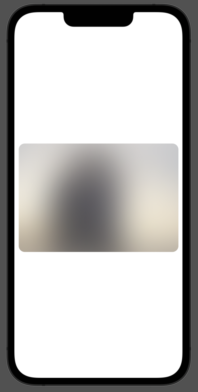
This should result in a heaviy blurred instance of your image:
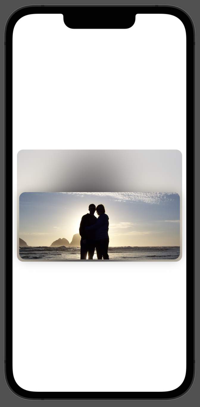
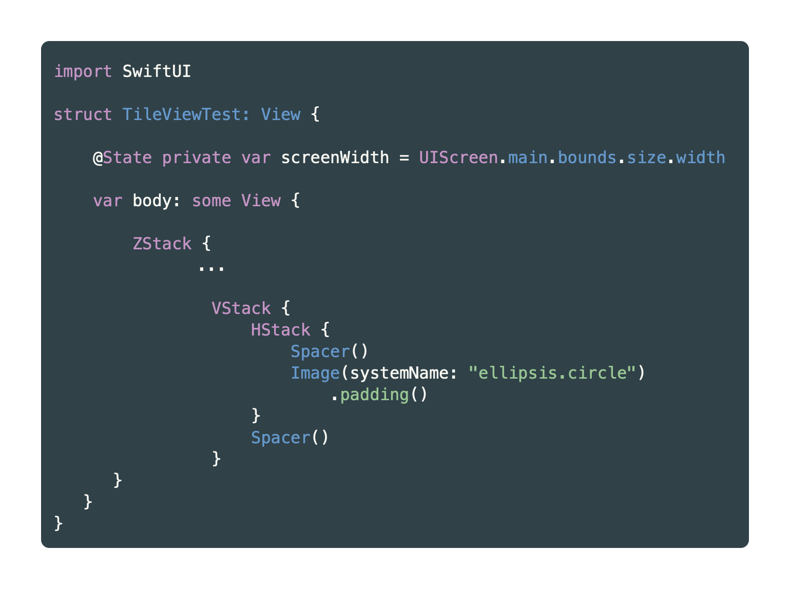
Next, let’s work on adding the forground image. Because this image will be presented in front of the background image, we’ll want to put both Views in a ZStack. Then, we’ll use a combination of VStack, HStack and Spacer() to center the image horizontally, and position it to the bottom.
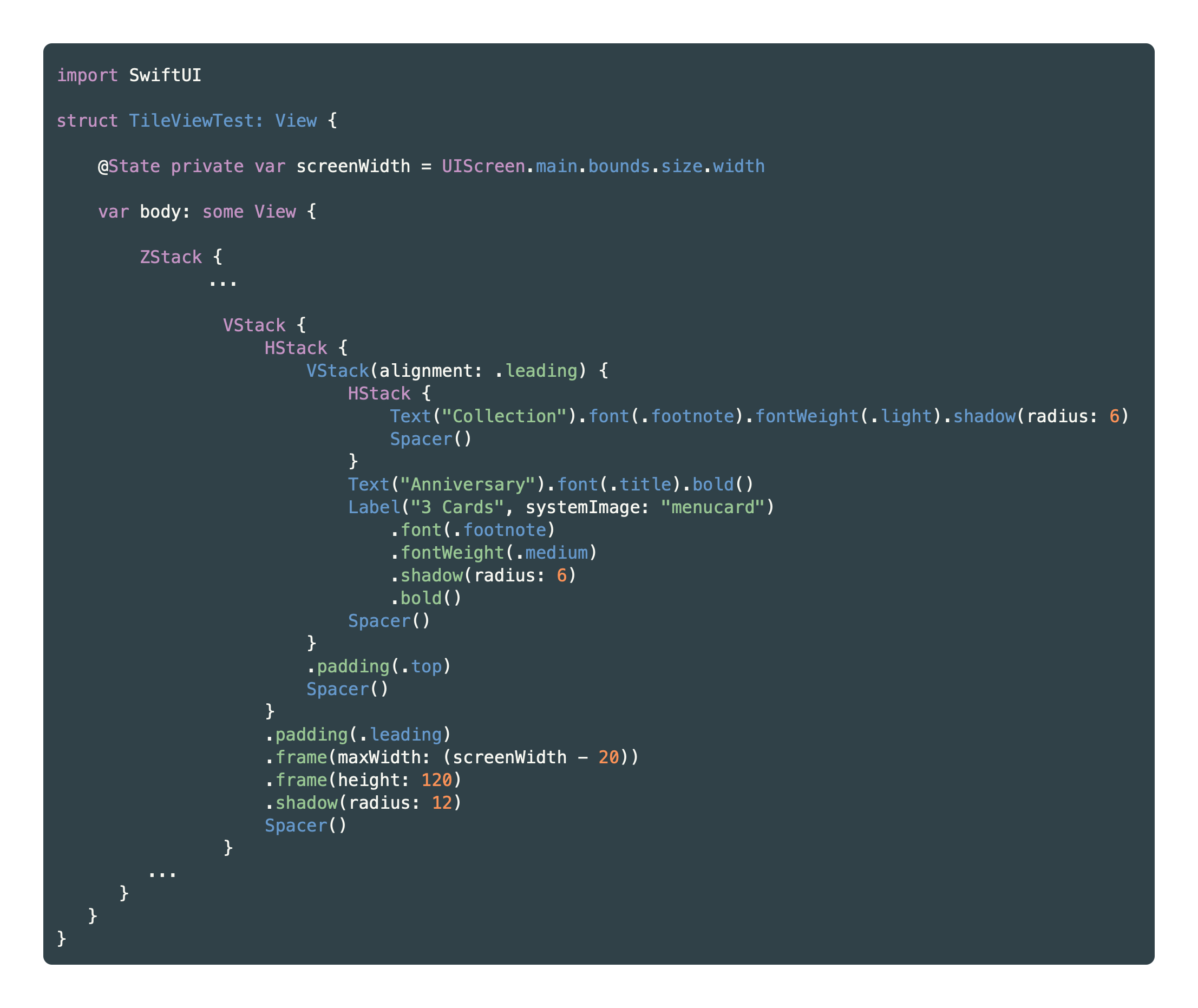
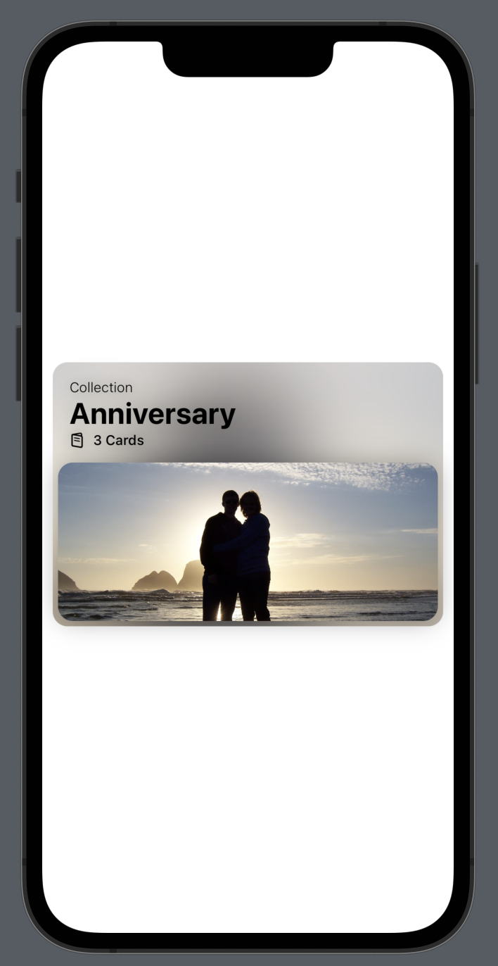
Already this is coming together! Now we’re looking at adding some Text and a Label. Toss these into some more VStack and HStack views along with Spacer() to position appropriately. You’ll want to add this code within your ZStack in between the two image Views:
The final touch to match our design to the source is to add the little ellipsis.circle SF Symbol to the top right corner. I love using SF Symbols wherever possible - they’re easy to integrate, and super flexible to make work in any kind of design. Let’s add this little icon to our View by putting the below code inside our ZStack at the very bottom:
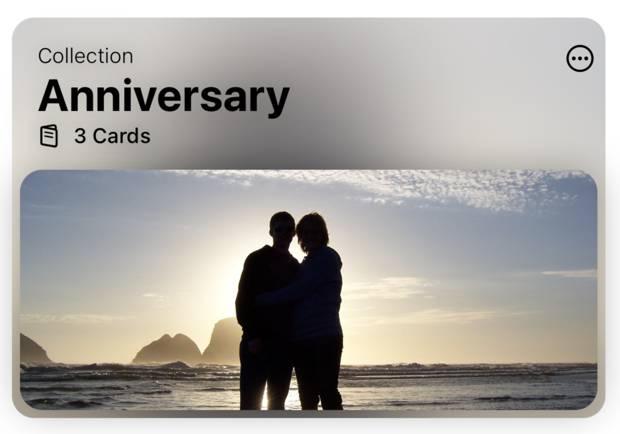
Not too shabby! Notice I chose not to change the font to match the source – I stuck with the default font. Go ahead and play around with your final product and see how you can tweak it to your liking.
A similar design inspired by Apple’s demo app is debuting in Hello There version 1.3 launching in February 2023, I think it looks pretty good!
I hope you enjoyed coding along. Thanks for reading!