You can put your app's paywall in an Alert. But you probably shouldn’t
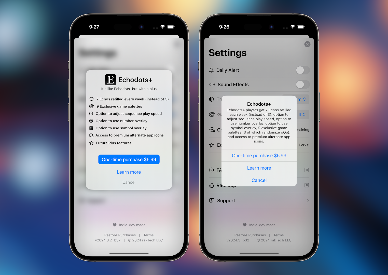
I was recently surprised to find that App Review accepted a build of Echodots where my Freemium IAP Paywall was built entirely into a system Alert. I don’t have any real reason to have believed that such a configuration wouldn’t be allowed. Do other apps do this? Was I just being lazy? It was a genuine concern the app would get rejected on this single aspect.
The idea was simple, because the IAP itself was simple: A one-time non-consumable IAP to unlock premium features. Because the features started out small, it was easy to implement and was intentionally not very showy of a paywall.
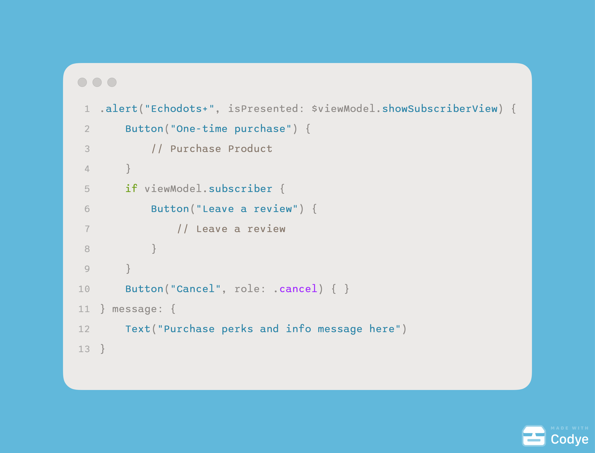
This code, when built out, generated the below paywall (alert) when triggered:
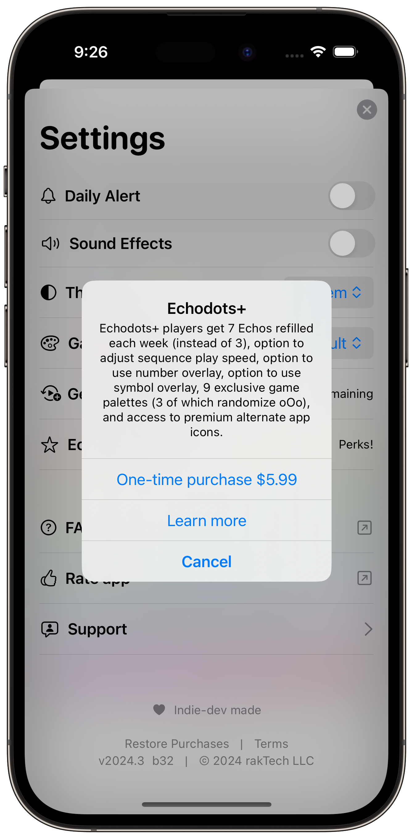
Simple, which is what I wanted. It matches the overall vibe from the rest of the Settings experience (yes, your app’s Settings menu is an experience that should be considered, just like the main views and ux of your app). But when the feature list grew, the text block was too wordy, creating an eyesore. Given that Alerts are intended for users to quickly respond to a system state change within your app, there’s not much formatting allowed in the message text block.
Designing the paywall
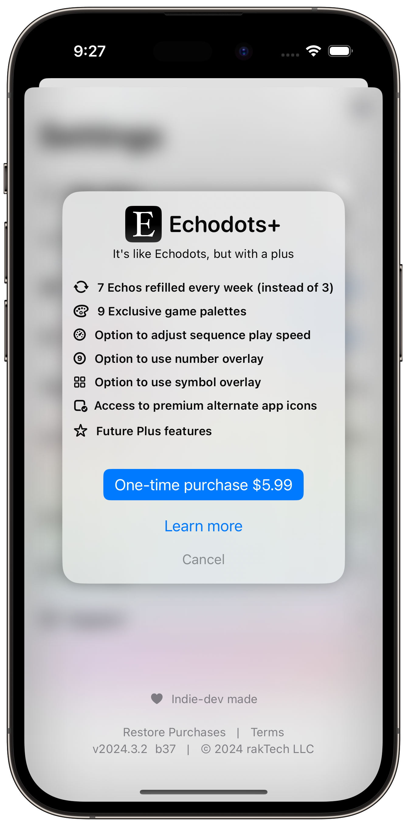
This pushed me toward having to create a new paywall view for users. I decided to stick with less is more for this app (definitely not the case for my paywall in Hello There) and chose to more or less recreate the alert style popup, but with the formatting I wish I could configure natively.
This features a premium icon, available with the plus purchase, and lists out the plus features in a much more digestible format using Labels. I think I achieved my goal. A no frills, easy to understand, straight forward paywall.
Alerts can still be good for IAPs
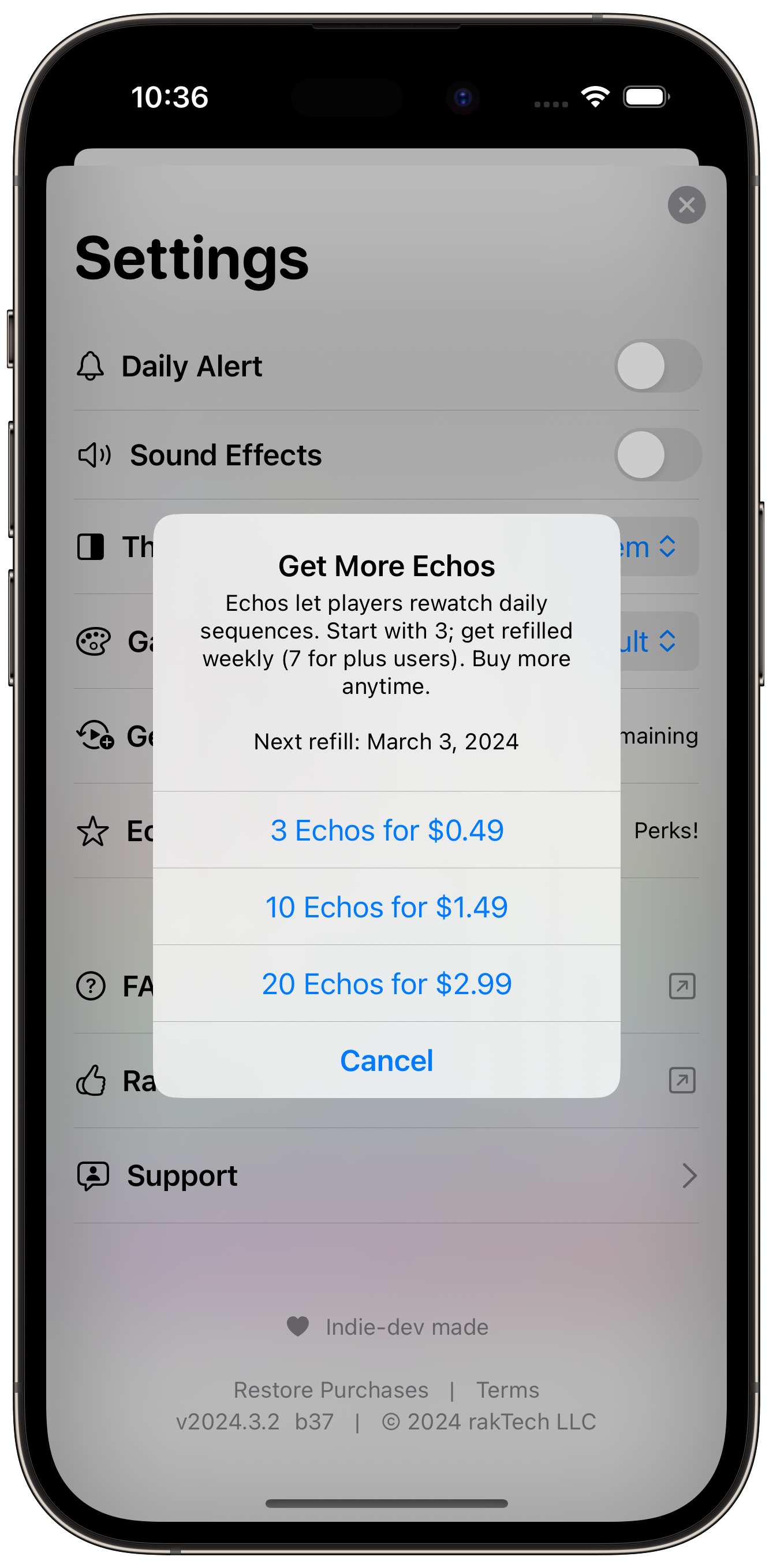
Ok Ok Ok I know that this post’s title says you probably shouldn’t put your app’s paywall into an Alert. And I still believe that. However, alerts can still be a great choice for other in-app purchases. In Echodots, I’m using an Alert to present players with consumable purchases. This is an entirely different experience as opposed to the primary Freemium Paywall though, as this is a screen that players could potentially come back to regularly whereas the Echodots+ view is likely to only be seen once. Therefore, designing the consumable view in such a way that encourages quick actions and minimal distraction is important.
I think a key aspect to any alert screen is balancing brevity with useful data to help the user make an informed choice.
All in all, there’s a lot of freedom when it comes to building a paywall. Capturing the ROI and convincing your users of its value is a balancing act that you may have to tweak again and again.
Thanks for reading!